UI vs UX in 2026: What’s the Difference and How AI Is Changing Both
They get used interchangeably all the time – in job listings, in client briefs, in team introductions. ‘We need a UI/UX designer.’ ‘Can you do the UX for this?’ ‘The UI looks great but the UX needs work.’ Most of the time, the people saying these things have a rough sense of what they mean. But rough senses lead to wrong hires, misaligned briefs, and products that look impressive in a Figma file and frustrate users the moment they actually try to use them.
The difference matters more in 2026 than it ever has. AI tools are now handling a significant portion of visual execution — generating layouts, suggesting colour palettes, creating component variants. The parts of design that are harder to automate are the strategic, research-driven, empathy-intensive decisions that live firmly in UX territory. If you don’t understand what UX actually means, you can’t make intelligent choices about what to invest in, what to delegate to tools, and what requires a human expert.
This guide draws a clear line between both disciplines, explains where they overlap, shows what happens to products when either is neglected, and covers in detail how AI is reshaping both fields in 2026 — not with speculation, but with data from live sources published in the last 60 days.
1. UI Design – What It Actually Means
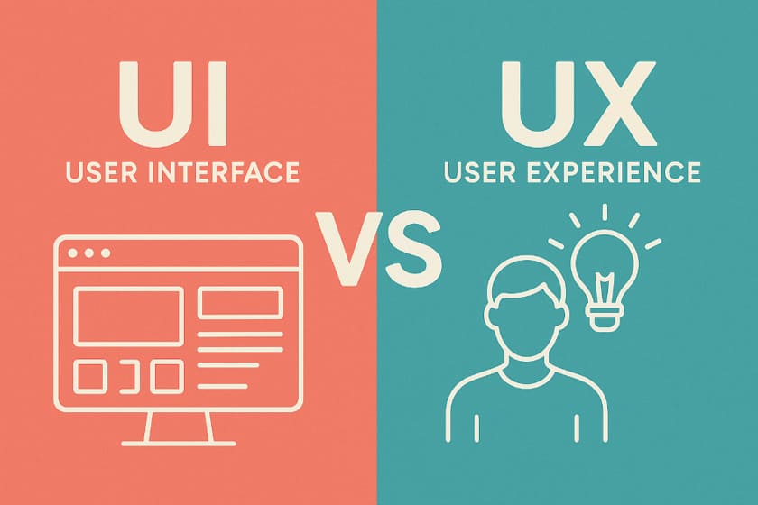
UI stands for User Interface. It’s everything you see, touch, and click. The buttons, the typography, the colour system, the spacing between elements, the way a modal animates onto the screen, the hover states on a navigation menu. If a user can perceive it directly with their eyes or fingers, UI design put it there.
That definition makes it sound superficial, but it isn’t. Good UI design is a deeply skilled discipline. Colour theory, typographic hierarchy, visual weight, accessibility contrast ratios, responsive grid systems, microinteraction design — these require years of practice to do well and significantly affect whether users trust, enjoy, and return to a product. A UI designer is not an illustrator who happened to get a job in tech. They’re specialists in how visual systems communicate, guide attention, and build brand trust at scale.
What UI Designers Actually Do Day to Day
Beyond Making Things Look Good
A UI designer in a typical product team takes wireframes or UX flows and translates them into high-fidelity visual designs. They build and maintain a design system — the library of components, tokens, and rules that ensure visual consistency across every screen. They work closely with frontend developers to ensure the design is achievable in code and that handoff documentation is clear enough to avoid misinterpretation.
In 2026, a significant part of their work also involves managing what AI tools produce. Figma AI generates multiple layout variations from a text prompt. Uizard converts hand-drawn sketches into editable screens. The UI designer’s job has shifted from pure creation to intelligent curation — evaluating AI outputs, refining them against the brand system, and ensuring they meet accessibility standards that AI tools still handle inconsistently.
The Core Skills of UI Design
What Separates a Strong UI Designer From an Average One
- Visual hierarchy — structuring information to support the intended reading order and guiding the eye deliberately
- Colour theory and brand consistency — building colour systems that work across light and dark modes and meet WCAG accessibility contrast requirements
- Typography — selecting typefaces, defining responsive type scales, and understanding how weight and size communicate tone
- Component design and design systems — building reusable components that developers can implement consistently
- Microinteractions — small animations and state changes that make interfaces feel responsive without being distracting
- Responsive and adaptive layouts — designing for mobile, tablet, and desktop without treating any one as an afterthought
2. UX Design – What It Actually Means
UX stands for User Experience. It covers every aspect of how a person feels when interacting with a product — not just visually, but functionally, emotionally, and over time. As Nielsen Norman Group (Jan 2026) explains, UX ‘has always been most impactful when its principles shape every layer of the experience — the interface and what people see on screen, as well as the system behavior and underlying logic.’
UX design is concerned with questions like: Why does a user come to this product? What job are they trying to get done? Where do they get confused? What makes them leave and what brings them back? These aren’t visual questions — they’re behavioural, psychological, and strategic. A UX designer is part researcher, part analyst, part systems thinker, and part advocate for the person who will actually use what the team builds.
In 2026, NN/Group describes UX as being ‘more than UI’ not as a gentle reminder but as a warning — as AI handles more visual execution, the strategic, research-driven, empathy-intensive parts of design are where real value is being created and defended (NN/Group, Jan 2026).
What UX Designers Actually Do Day to Day
The Research and Systems Work That Happens Before a Single Screen Is Designed
A UX designer’s work typically starts before the product exists. They conduct user interviews to understand what problems real people have. They analyse competitors to identify gaps and patterns. They build user personas — not marketing demographics, but behavioural archetypes that capture what motivates different user types and where those motivations conflict.
From research, they move to architecture: information architecture (how content and features are organised), user flows (the paths users take to complete tasks), and wireframes (low-fidelity structural layouts showing what goes where without committing to how it looks). Then they test. A UX designer running a usability test on a paper prototype before development starts can identify problems that would cost $20,000-$50,000 to fix after the product was built.
Post-launch, the work continues. Session recordings, funnel analytics, NPS surveys, and customer support data all feed back into UX decisions about what to fix and what to build next. Good UX is a loop, not a phase.
The Core Skills of UX Design
What Separates a Strong UX Designer From an Average One
- User research – structured interviews, usability testing, surveys, contextual inquiry — and the ability to extract insights from messy qualitative data
- Information architecture – organising content into structures that match how users think, not how the company is organised internally
- User flow and journey mapping – documenting the paths users take, including the emotional state at each step
- Wireframing and prototyping – creating low and mid-fidelity representations that can be tested without being built
- Data analysis — interpreting product analytics to identify where users drop off, succeed, and what their behaviour implies about intent
- Accessibility thinking – designing for users with different abilities and cognitive styles as a fundamental constraint, not a late-stage checklist
- Stakeholder communication – translating research findings into product decisions that developers, product managers, and business leaders can act on

3. UI vs UX – The Clearest Way to Understand the Difference
The analogy that holds up best: UI is the car’s interior — the dashboard layout, the seat materials, the button placement, the lighting. UX is the entire driving experience — does the seat adjust to your body? Is the road well-signposted? Does the car warn you about low fuel before you run out, or after? Can someone unfamiliar with the brand figure out the controls in a parking lot?
A car can have beautiful interior design and still be a terrible driving experience. It can also have a functional, unbeautiful interior and be genuinely pleasant to drive. Both matter. They’re just different things, built by different disciplines, evaluated by different criteria.
| Dimension | UI Design | UX Design |
| Core question | How should this look and feel? | Does this solve the user’s actual problem? |
| Primary deliverables | High-fidelity screens, design system, component library, style guide | User research, personas, wireframes, user flows, usability test reports |
| Tools (2026) | Figma, Adobe XD, Figma AI, Midjourney (mood boarding), Adobe Firefly | Maze, UserTesting, Hotjar, Miro, Figma (wireframing), PostHog, Amplitude |
| When in the process | After UX architecture is defined — UI visualises what UX has structured | From the very start — before a screen is designed, UX defines what to build |
| Success metric | Visual consistency, accessibility compliance, design system coverage | Task completion rate, time-on-task, NPS, churn reduction, activation rate |
| What bad looks like | Inconsistent components, poor contrast, cluttered screens, slow load perception | Confusing navigation, dead-end flows, unclear empty states, high drop-off at key steps |
| What AI is changing | Generating layout variants, automating components, design-to-code output | Automating research synthesis, predicting user needs, personalising journeys |
4. Where UI and UX Overlap – and Why the Line Isn’t Always Clean
The distinction is real and important, but the two disciplines don’t live in separate rooms. In practice — especially at smaller companies where one person covers both roles — they blend at several points.
Microinteraction design sits at the intersection. The animation that plays when a user completes a form step is a UI decision (how it looks, how long it lasts) and a UX decision (does this signal success clearly? does it reduce anxiety about whether the form submitted?). The same designer thinking about the same thing from two angles simultaneously.
Prototyping is another overlap zone. A high-fidelity clickable Figma prototype is technically a UI artefact — it has visual design applied. But its purpose is UX research — to test whether users can navigate the intended flow before anything is built. The deliverable is UI; the intention is UX.
Accessibility sits at the intersection in a particularly interesting way. Colour contrast ratios are a UI decision. Whether a feature is discoverable by keyboard navigation is a UX decision. Whether an error message explains what went wrong in plain language is a writing decision that lives in UX territory because it determines whether users can recover from mistakes and stay in the product.
The UI/UX Designer Role – What It Actually Means
Why Full-Stack Design Roles Are Common and When They Cause Problems
Most job listings say ‘UI/UX Designer.’ That’s a compressed role that means different things at different company sizes. At an 8-person startup, a UI/UX designer probably does user interviews, wireframes, the design system, and the high-fidelity screens — because there’s no one else. At a Series B company with 80 people, the same title might mean UI work only, with dedicated UX researchers handling research separately.
The problem comes when companies hire for UI skills and call it UX, or when a UI designer is asked to do UX work they haven’t been trained for and the research gets skipped entirely. A visually talented designer who has never conducted a structured user interview and doesn’t know how to interpret funnel analytics is not a UX designer, regardless of their job title.
5. What Happens When You Get Either One Wrong
Abstract distinctions become concrete quickly when you look at what product failure actually looks like in practice.
When the UI Is Weak
Good Flows, Poor Execution – and the Trust Problem It Creates
A product with strong UX and weak UI has the right architecture but the wrong presentation. Users can figure out how to do what they need to do, but the product feels rough, inconsistent, or unpolished. In B2C, this kills conversion. First impressions form in milliseconds. A product that looks unfinished signals that it might be unfinished in ways users can’t see — security, reliability, data handling.
In B2B SaaS, weak UI has a slightly longer runway because business buyers evaluate products more deliberately. But it still affects renewal decisions. A product that users dread opening because it’s visually stressful creates a drag on retention that compounds over time.
When the UX Is Weak
Beautiful Products That Nobody Can Use – the More Expensive Failure
A product with strong UI and weak UX looks impressive until someone tries to use it. The onboarding is confusing. The navigation doesn’t match how users think. Critical features are buried three levels deep. Users hit dead ends they can’t recover from without support. They churn.
This is the more expensive failure mode, and the one that catches more teams off guard. A product that looks good gets past the first evaluation stage — it wins demos, passes design reviews, gets approved by stakeholders judging it visually. The UX problems only surface once real users are in it, by which point you’re spending development budget on rework. 88% of users won’t return after a single bad experience (index.dev, 2026). That’s not a recoverable statistic on a tight runway.
6. How AI Is Changing UI Design in 2026
AI’s impact on UI design in 2026 is not a future trend — it’s an active transformation happening inside the tools most designers already use. The changes are significant regardless of whether you’re a designer figuring out workflow, a founder deciding who to hire, or a team trying to understand where design investment goes.
Figma AI – From Canvas to Collaborator
What Figma’s Native AI Layer Actually Does in 2026
Designers can now type a prompt — ‘Create a dark-mode SaaS dashboard with real-time data visualization’ — and Figma AI generates a multi-screen starting point with editable layers, reusable components, and organised frames. Not a static image; a working design file (Designfest, 2026). Figma AI’s ‘Check Designs’ linter catches inconsistencies before handoff — mismatched spacing tokens, components drifted from the system, accessibility failures. The one-click Auto Layout cleanup reorganises messy layer structures into developer-friendly files. AI-powered prototyping lets designers describe a flow in plain language and have interaction logic applied automatically, replacing hours of manual connection drawing between screens (Muzli Blog, Feb 2026).
Figma AI works best for systematic, standards-driven work — keeping designs aligned to the design system and reducing blank-canvas paralysis on known screen types. It’s less useful for genuinely novel creative exploration, where its tendency toward predictable outputs becomes a constraint.
Midjourney, Adobe Firefly, and Uizard
Where Each Tool Fits in the 2026 UI Design Workflow
Midjourney has become standard for visual exploration and mood boarding. Designers use it to generate UI theme concepts to show clients creative direction before committing to actual screens. The outputs rarely go into production files directly, but they accelerate the conversation about aesthetic direction. By 2026, Midjourney simulates natural imperfections — subtle textures, atmospheric lighting — that make outputs feel less clinical (Oreate AI, Jan 2026). For brand-focused design and conceptual work, it’s now a genuine workflow tool.
Adobe Firefly integrates directly into Photoshop and Illustrator, making it the choice for teams in the Adobe ecosystem. Its strength is production work — generative fill for mockup assets, layout alternates, background generation. The output is more conservative than Midjourney but more reliably usable in commercial contexts (Figma resource library, 2026). Uizard handles the earliest stage: converting hand-drawn sketches or text descriptions into editable digital interfaces. A designer can photograph a whiteboard wireframe and watch it become a themed starting point in seconds (Designfest, 2026).
Design-to-Code – The Gap That Is Finally Closing
What Cursor, v0, and Figma MCP Mean for the UI Designer’s Role
Two years ago, design-to-code was more aspiration than reality. In 2026, the combination of Cursor (an AI code editor that understands design intent), v0 by Vercel (text-to-app builder using shadcn/ui), and Figma’s MCP connection means a designer with some frontend comfort can go from Figma file to working React component with surprising speed (Muzli Blog, Feb 2026). A UI designer who can ship components is faster, requires less translation overhead, and makes design decisions informed by implementation constraints. The role is evolving from visual creator to design system architect who speaks both languages.
| AI Tool | Primary UI Use Case | Best For |
| Figma AI | Layout generation, design system linting, auto-layout cleanup, flow prototyping | Teams maintaining design systems at scale |
| Midjourney | Mood boarding, UI theme concepts, visual direction, custom brand assets | Early client direction-setting; visual exploration before screens are designed |
| Adobe Firefly | Mockup assets, generative fill, layout alternates, background creation | Adobe ecosystem teams; production-grade mockup and asset work |
| Uizard | Sketch-to-UI conversion, rapid concept screens, MVP wireframing | Non-designers, early-stage founders, rapid concept validation |
| Cursor + v0 | Design-to-code, component generation from design tokens, React output | Frontend-aware designers who want to close the handoff gap with developers |
7. How AI Is Changing UX Design in 2026
AI’s impact on UX is less visible than on UI — no dramatic screen-generation demos — but it’s arguably more significant. The research, analysis, and synthesis work that traditionally took weeks is being compressed. And entirely new UX challenges have emerged around designing for AI-powered products themselves.
AI-Assisted Research – Faster Synthesis, Not Replacement
What AI Research Tools Actually Change About the UX Process
The bottleneck in UX research has never been collecting data — conducting 20 user interviews is achievable in two to three weeks. The bottleneck is making sense of it. Synthesising 20 interview transcripts into patterns, themes, and actionable insights is genuinely time-consuming and cognitively demanding.
AI tools are compressing this. Miro’s Assist feature automatically clusters sticky notes from research sessions by keyword, sentiment, or theme, and summarises boards into actionable points. Maze’s AI layer generates predictive heatmaps showing where users will likely look before you build anything. UserTesting’s AI summarisation tools condense session recordings into highlights that surface the most relevant moments without watching every minute of footage.
The important caveat, flagged by NN/Group (Jan 2026): ‘human direction, curation, and verification will continue to be essential for distilling insights for good products.’ AI accelerates synthesis but doesn’t replace the judgement required to turn patterns into product decisions. A UX researcher who can recognise when an AI summary is missing the point of what users actually said is significantly more valuable than one who relies on the summary alone.
Anticipatory Design and Generative UI
The Shift From Static Screens to Adaptive Systems
One of the most significant UX shifts of 2026 is what AND Academy (published two weeks ago) calls Anticipatory Design — interfaces that respond to inferred user intent rather than waiting for explicit input. Instead of a static dashboard showing every user the same data, an anticipatory system learns which features a user actually uses, which data they check first, and what their next action is likely to be — and adapts accordingly.
Netflix is the commonly cited example. They’ve updated their foundation model to recognise user needs and predict future behaviour, adjusting what gets surfaced and in what order (UX Studio Team, 2026). For UX designers, this creates genuinely new work. You’re no longer designing a single canonical flow. You’re designing systems with multiple states, behavioural triggers, and edge cases — and the AND Academy concept of Generative UI captures this well: AI rebuilds the interface in real-time based on user intent, focusing on the outcome rather than a fixed navigation path.
Designing for AI Products – The New UX Frontier
Trust, Transparency, and Control When the System Is an AI
A growing portion of UX work now involves designing how users interact with AI features — not using AI as a tool, but designing the experience of AI-powered products. This is genuinely new territory, and the early signals are not uniformly positive.
UX Collective (Jan 2026) describes the core challenge clearly: ‘When users interact with AI tools, many walk away uncertain about what the system actually did or the reasoning behind its decisions.’ The explainable AI market is projected to reach $33.2 billion by 2032 precisely because users won’t adopt features they can’t understand. NN/Group (Jan 2026) identifies trust as a defining UX design challenge this year: ‘People who’ve been burned by AI features are more hesitant to adopt new ones. Building that confidence requires fundamentals: transparency, control, consistency, and support when the system fails.’ That’s a UX brief, not a technical one.
Accessibility as a UX Priority – Neuro-Inclusion in 2026
Designing for the Full Spectrum of Users, Not Just the Average One
Accessibility has moved well beyond colour contrast ratios and screen reader support. The emerging concept of neuro-inclusion — designing for users with ADHD, autism, dyslexia, and other cognitive differences — is shaping UX decisions at serious product teams (AND Academy, Feb 2026; index.dev, 2026). Practically: optional minimalist modes that strip interface noise for focus. Motion-aware interfaces that respect sensitivity settings. Notification systems that honour mental bandwidth rather than constantly demanding attention. Information architecture that reduces cognitive load by default.
1 in 5 people experience products differently due to neurodivergent conditions (index.dev, 2026). That’s not a niche — it’s a substantial portion of every product’s user base. The digital accessibility software market is projected to reach $1.89 billion by 2034 (mobileappdaily.com, 2026). Companies that build accessibility in from the start aren’t just doing the right thing — they’re avoiding expensive retrofits and the legal exposure that’s growing as WCAG enforcement increases globally.
8. UI and UX Trends Shaping 2026
Liquid Glass and the Return of Depth in UI
Flat design has dominated for a decade and it’s beginning to give way. Apple’s Liquid Glass design language — translucent surfaces, fluid motion, light refraction across elements — has reintroduced depth and materiality in a way that feels modern rather than retrograde (UX Studio Team, 2026). The key distinction from older skeuomorphism is subtlety: gentle physical metaphors, not realistic wood textures. The practical implication for UI designers: designing with translucency and motion requires technical coordination with frontend developers and performance testing on lower-end devices.
Zero UI – Designing for Experiences That Don’t Rely on a Screen
Voice technology is finding its moment, but not by replacing screens — by complementing them. UX Collective (Jan 2026) describes context-aware, multimodal experiences that blend voice, touch, and visuals based on what the user is doing: hands busy while cooking, impractical to type in a meeting, eyes occupied while driving. 157.1 million people in the US are expected to use voice assistants by end of 2026 (UX Collective). For UX designers, this means designing flows that work across input modes rather than adapting a desktop-first experience downward.
Resolution Velocity – The New UX Metric
One of the most important UX concept shifts of 2026 is ‘resolution velocity’ (blog-ux.com, 2026) — measuring how quickly a user’s actual intention is satisfied. Traditional metrics like time-on-site were proxies for engagement. In an age where AI can resolve intent in one step, five minutes on a product is more likely a failure signal than a success one. A user who gets what they need in 90 seconds and leaves has had a better experience than one who spends 10 minutes fighting navigation. This is changing how product teams measure UX success, and it directly challenges the attention economy logic that shaped product design for the last decade.
Neo-Brutalism – Design With Personality in the Age of AI Homogeneity
A counter-movement is emerging in UI design: Neo-Brutalism 2.0 (blog-ux.com, 2026) — bold typography, high-contrast colours, deconstructed grids, deliberate imperfection. It’s a direct reaction to the overly smooth, increasingly similar aesthetic that emerges when many products use the same generative AI tools for visual direction. When Midjourney produces similar outputs for everyone, some designers go deliberately in the opposite direction to signal authenticity and human intent. Not right for every product — enterprise B2B is not going Neo-Brutalist — but for consumer products targeting visually-attuned audiences, it’s a meaningful differentiator.